


Substack: The Downward Slope of User Experiences and Other Changes
Of Transparency, Payment workflows, and Best-in-Class Product Management
🎉Celebrating 1,000 Readers: A Big Thank You and a Special Offer!
As a token of appreciation, I’m offering a 50% lifetime discount on premium access for a limited time on all plans. Upgrade now to unlock all premium posts and exclusive how-to videos.
Your subscription helps keep the publication independent and free of ads, and affiliate links.

Substack’s ‘Silent Rollouts’: A User Experience Nightmare?
As Substack continues to evolve with new features and updates to its Settings UI, it’s becoming clear that some changes are happening without much fanfare—or communication.
While innovation in the interest of the customer is always welcome, removing or altering features without informing users can lead to a poor user experience.
The Mystery of the Missing Settings
Recently, Gary Varner alerted me to a missing setting referencing an article I published on January 24 about choosing topics to follow. This issue sent others also seeking clarification on impact and how to adapt.
It turns out Substack is now automatically deciding what we see or follow, with limited input from us—primarily through subscriptions or recommendations.


While some changes address issues I raised earlier in this article, the lack of transparency in how these updates are being rolled out is concerning.
Why?
Because hundreds of aspiring independent writers have built their businesses on the platform and are supporting Substack by offering valuable services to others on how to build on Substack—without being part of any incentive or support program that Substack offers—ignoring this user base and causing them to scramble to discover the changes on their own time is not a best practice.
The Importance of Backward Compatibility
In software development, backward compatibility is key. When new features are introduced or old features are retired, it's crucial to consider how they will impact existing users.
If platform changes affect usage or if effective features are altered or removed, product teams need to consider how to communicate these updates so users can adapt or, if the changes are irreversible, plan for a smooth transition.
In this scenario, the focus is more on adaptation than migration.
For example, a writer recently shared their excitement about a new "Table of Contents" (TOCs) feature for posts.
Below, you can see the automatic hover menu that now appears on my most recent post, but it's easy for both readers and writers to miss this feature since it's indicated by subtle horizontal lines.

Previously, we had to manually create TOCs using anchor links, but now Substack offers an automatic solution when you use the right styles—yet it's not officially communicated anywhere!
Even the Substack help desk bot doesn’t seem to have received the memo on how TOCs are generated. In fact, it still suggests, 3 weeks after feature was released, that there is no automation.


How can writers learn about this feature at the earliest and bring it to their readers' attention especially when the new feature helps improve their experience?
Does Substack favor "silent" rollouts, as posted in Notes by the founder, leaving users to discover new features—or the lack thereof—on their own?
Note from Founder

Inconsistency in communication modes is also an issue for ensuring consistent user experiences.
For example, a minor update to the comments section now differentiates between post comments and restack comments with separate tabs under the comments section.
This was shared by Substack today as an inline message on the dashboard page.
But why was only this update communicated, and not the introduction of the table of contents feature?
Whether intentional or not, this kind of inconsistency or ‘silent’ rollout can only be frustrating for seasoned and early adopter users who rely on transparent communications to promote the platform.
So What Changed on Substack?
Here’s a rundown of some changes discovered on the platform:
If you know of others, please drop a comment! Caveat: Please note, these observations may vary or become outdated soon and we may never know! :-)

New Post Only Launch Option: New writers can now launch a post on the app/desktop by setting up a profile without creating a publication, similar to Medium. This seems like a temporary workaround to avoid forcing new users to navigate the cumbersome Settings page to create a publication. Users can later choose to convert their posts into a publication, which raises questions like when they should make this conversion. Since a branding kit was optional, why not default to launching as a post and reserve the rest for Advanced mode, sparing users the burden of converting later?
Publisher Dashboard Menu Setting: There’s now a ‘Publisher Dashboard’ link on your profile page, which simply redirects you to your existing Dashboard. This change appears to accommodate the new post-launch feature mentioned above.
Feed Choices: What you see in your feed is now primarily determined by the publications you are subscribing to, and recommendations you are choosing to make. Some speculate that site tags are involved, but I haven’t found any evidence that your website tags influence Substack’s recommendation algorithm. If they do, it would be a strange connection, as tags are meant to organize your content, not to indicate interests on the platform.
Inline Image Editor: You can now edit, crop, and modify your uploaded images directly within the editor. Just select the ‘Edit’ option from the ‘…’ menu after uploading an image file. It seems not to work for generated images. To demo it, I cropped and added a Substack sticker on the ‘Note’ image uploaded above. A cool feature addition, if only there had been an easy way to know about it when it dropped!
New Medium-Style Topic Menu: A new Medium-style topic menu is now available above the carousel. Carousel colors are randomly assigned by Substack and no longer derive from the publication's theme colors. You still cannot follow specific topics and are limited to following authors and the feeds influenced by the two categories under which you file your publication.


Settings Menu Changes: The Settings menu has been reorganized and grouped to offer a semblance of order, which was a previously highlighted issue. However, simply grouping them without indicating optional settings feels like a missed opportunity.
Merged or Removed Settings:
Manage Interests: This option—where you could influence the topics of interest—has been removed. Presumably, the algorithm has become smarter at recognizing your reading preferences and predicting suggested reading choices.
Block robots.txt: Now replaced by a new AI training setting, with no clear explanation of its impact on Google search. It seems this function has been delinked from Google Search and is now tied to AI platforms only, though this requires further confirmation due to the platform’s bugs.
Bottom Line

Users shouldn’t have to write posts or play detective to figure out how features work or are removed.
With advancements in generative AI, any product team, especially at a scaling startup, can easily provide official product release notes and a comparative matrix of feature changes at minimal cost. Here’s an example I created for gadgets, showcasing the power of generative AI to transform the future of shopping.
One solution would be to host a generative AI-powered Substack product release update stack, ensuring users aren't left to solve the mysteries of feature roadmaps, upgrades, and deletions!
Consider Google’s best practice of announcing features being retired or updated at high user volumes.
Even Medium does a good job of letting users know what has changed and why—its product managers write to users directly, enabling us to understand and offer input. They also offer a monthly roundup post.
Detrimental Policies: A Cautionary Tale

Beyond user experience issues, Substack's policies can sometimes be detrimental to writers.
The first issue occurred when I learned, to my detriment, that while we are in ‘control’ of our publication, Substack’s trust and safety algorithms can randomly block us on the platform as spam.
This happened without any clear reasons offered for why an established writer with two publications and a revenue base can be caught in the algorithm this way. Substack has yet to provide an explanation—even after three months—about what triggered the block or how they intend to prevent it in the future.
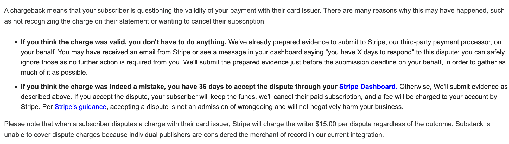
The second issue relates to Substack's payment dispute policies.
For example, did you know that if a subscriber disputes a charge—even if mistakenly so—the associated fee from Substack’s payment provider, Stripe, is charged to the author—even if the dispute is settled in the author's favor?
This $15 fee per dispute can quickly eat into your revenue, especially when Substack controls all financial workflows and charges a 10% revenue fee.
Ideally, this fee should cover such costs. A fairer partnership agreement with Stripe—given the volume of business Substack handles—could help protect writers from these unexpected costs.
The irony is that Substack controls all platform subscription and payment workflows, cancellation policies, and the credit card information.
No author has access to edit the workflows or credit card information. So to assume that the author has made a mistake is misleading.
This policy is poorly designed for writers to assume the responsibility as ‘publisher’ but not have control over any of the actions related to the workflow, policies, or the information.
Therefore, for Substack to state that their current integration does not enable covering dispute fees because of their implementation and business process is puzzling.
Regardless, Substack can refund the fees from the 10% fees held if they so wish—it has no bearing on the integration.
Alternatively, they could offer writers the option to use bank transfers or other payment models outside of Stripe.
Conclusion

The practice of selectively taking user feedback—especially from only your best customers, versus early adopters and your growing user base—is not a best practice.
Building a customer-first approach has been a winning strategy for the best companies in the industry for decades, preserving a high customer service bar.
Promoting and focussing only positive comments in Notes, and refusing to listen to early adopters of a growing platform, seems retrograde.
User feedback—good, bad, and ugly—is a leading indicator for products, especially in the consumer and SaaS space.
I’ll continue evaluating newsletter platforms and offer insights into how the market is evolving for writing—stay tuned for my reviews of Ghost, similar to this premium post on beehivv.
🎉 Thank you for your incredible support that keeps this publication independent. As a token of appreciation, I’m offering a 50% lifetime discount on premium access for a limited time. Upgrade now to unlock all premium posts and exclusive how-to videos.
I'm really disappointed my feed and who I care to read are being manipulated. I've stopped exploring on the site because "suggestions" do not align with my interests. I get particularly annoyed with political directions. Thanks for the update, some of it I don't even understand so won't worry about it yet.
I have found the inline content menu to be clunky. I don't understand the Notes feed at all in the Inline Content menu. It is not fluid line Notes. It's more static and honestly to me I'd rather see a feed of newsletter posts than Notes.